Stories
Black and White Interior Design Colour Schemes
Colour trends are forever changing and sometimes it’s difficult to keep up; to know what’s in and what’s out. What we do know, though, is that black and white are two colours that are always in style. In this post we’re going to learn the correct colour terms and discover how to make this classic theme work in your home. Perhaps how we use these colours may change over time, but this is a classic partnership that works in many different settings, and one that’s always on trend.
Many people refer to the black and white colour scheme as being ‘monochromatic’ but that’s not actually correct. Let’s begin by sorting out the difference between the terms ‘monochromatic’ and ‘achromatic’.
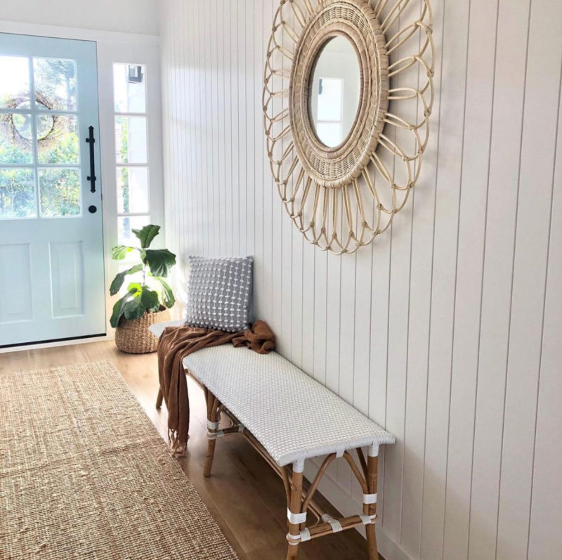
The intensity and vividness of a colour is represented by its saturation. Colours can broadly be divided into ‘chromatic’ and ‘achromatic’ colours, depending on the absence or presence of this saturation. A chromatic colour is any colour that has the slightest amount of hue while an achromatic colour lacks hues – like the colours white, grey and black.
Monochromatic
A monochromatic palette uses variations in saturation and lightness of one colour. An easy way to remember this is to understand that ‘mono’ means a singular subject or object, while ‘chrome’ refers to colours – therefore, ‘monochrome’ means a single colour.
Therefore, a monochromatic palette uses just one colour in varying shades and intensity, like varying shades of green. It’s sophisticated, timeless, and perfect for establishing an overall mood.
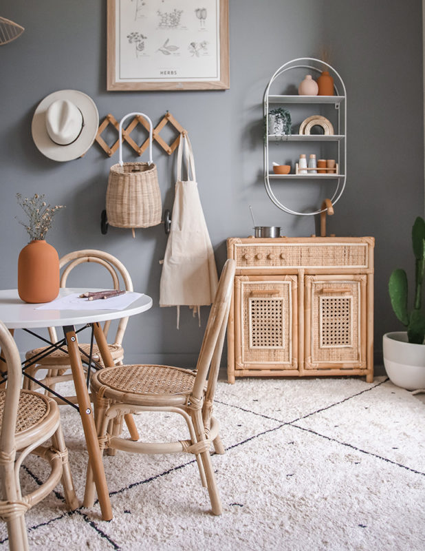
When people refer to a black and white palette, they’re actually referring to an achromatic palette – which means no colour.
Achromatic
When there’s an ‘a’ at the beginning of a word, it means the negation of the term, so, because ‘chrome’ means colour, ‘achromatic’ means without colour. Neutral colours like grey, white, and black are referred to as achromatic colours. Achromatic colours have lightness but no hue or saturation.
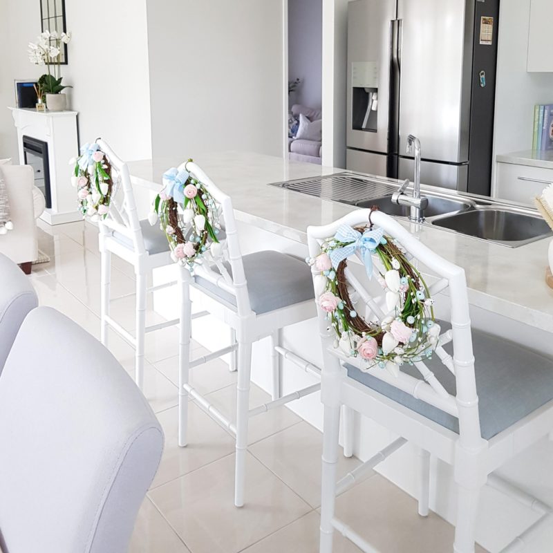
Achromatic colour schemes are used in many places, like professional photography, advertising, and contemporary decorating. An achromatic colour scheme offers a cleanliness and simplicity that can only be found in combinations of black, white, and grey.

Homeowners and interior decorators use achromatic color schemes to make rooms look simplistic and fresh. For example: white kitchen cabinets give the appearance of space. Bathrooms also use achromatic colour schemes for a fresh, clean look. Without overwhelming the space, grey and white fixtures and tiles effectively create the illusion of a large room. Even bedrooms can reap the benefits of an achromatic colour scheme because it has such a calming effect, which is ideal in a room that’s designed for resting.
Contrast: High versus Low
The term ‘contrast’ refers to the size of the gap between the brightest and the darkest.
- Low contrast refers to a small gap,
- High contrast indicates a large gap.
So when we speak about black and white, we’re referring to a very high-contrast look.

A black and white colour scheme creates an energetic, active feeling, making our eyes bounce around a space. However, there can be variations in contrast with black and white schemes too, with the tones in high-contrast schemes ranging from bright highlights to dark shadows.
Working with Black and White
A black and white colour scheme might sound pretty straightforward, but it can in fact vary a lot. It depends entirely on how much colour is used within a space, and where it’s used.
- More black than white
If you’re looking for a more sombre, den-like area, consider styling with black walls and black furniture, and adding finer white details through ornaments, cushions, and wall art. - More white than black
Use more white than black if you prefer your space to look light and airy. Style with white walls and furniture, then add small accents of black through table legs, picture frames, and ornaments.

- Adding grey to the mix
Grey has a beautiful softening effect when used in a black and white colour scheme. Consider using different tones of grey; you may also like to add small-scale black and white patterns, like houndstooth and checks.
- Try flipping black and white
Flip the balance for a more dynamic look. We typically see dark floors and light walls in homes, so consider turning this colour scheme on its head and style with light floors and dark walls.
You may be surprised at just how versatile and timeless black and white rooms can be. You have two choices here: either soften the black and white palette by adding a warm accent colour like mustard, the colour of rustic timber or a jute rug; alternatively, keep the space energized by committing to the black and white scheme.
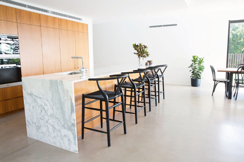
- Modernizing black and white
If you’re looking for a more contemporary urban look, begin by committing to the black and white scheme, then start experimenting with different tones of grey. A simple way to achieve this is with black and white photography and wall art.
- Black and White – it’s classic!
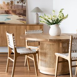
If you love the tradition and elegance of a country-style home, your black and white scheme can be warmed up with timber and other natural textures.
Dining Tables
Watego Outdoor Round Dining Table – 1.25m – Asteroid Black (charcoal) Powder Coated Legs
Dining Chairs
Dining Chairs
Accent and Armchairs
Dining Chairs
Accent and Armchairs
 07 5325 1507
  SMS 0482 085 960


