
More and more we’re noticing people becoming adventurous with styling their homes, and one question we’re often asked is how to mix timber tones in a room – and get it right! Many people say they’d love to experiment but are hesitant to combine different timbers in a space. Fortunately, mixing wood tones in a room can work beautifully, but there are a few basic rules to follow.
How To Mix Your Home’s Timber Tones with Different Tones of Timber Furniture
Regardless of whether you want to match pieces of timber furniture from different time periods, or you want to match your dining table to the floorboards, the key to success is to choose timbers with similar finishes or undertones. The aim should be to achieve a feeling of continuity, meaning there’s one characteristic or feature that appears in every piece. This feature or characteristic will tie your overall scheme together.

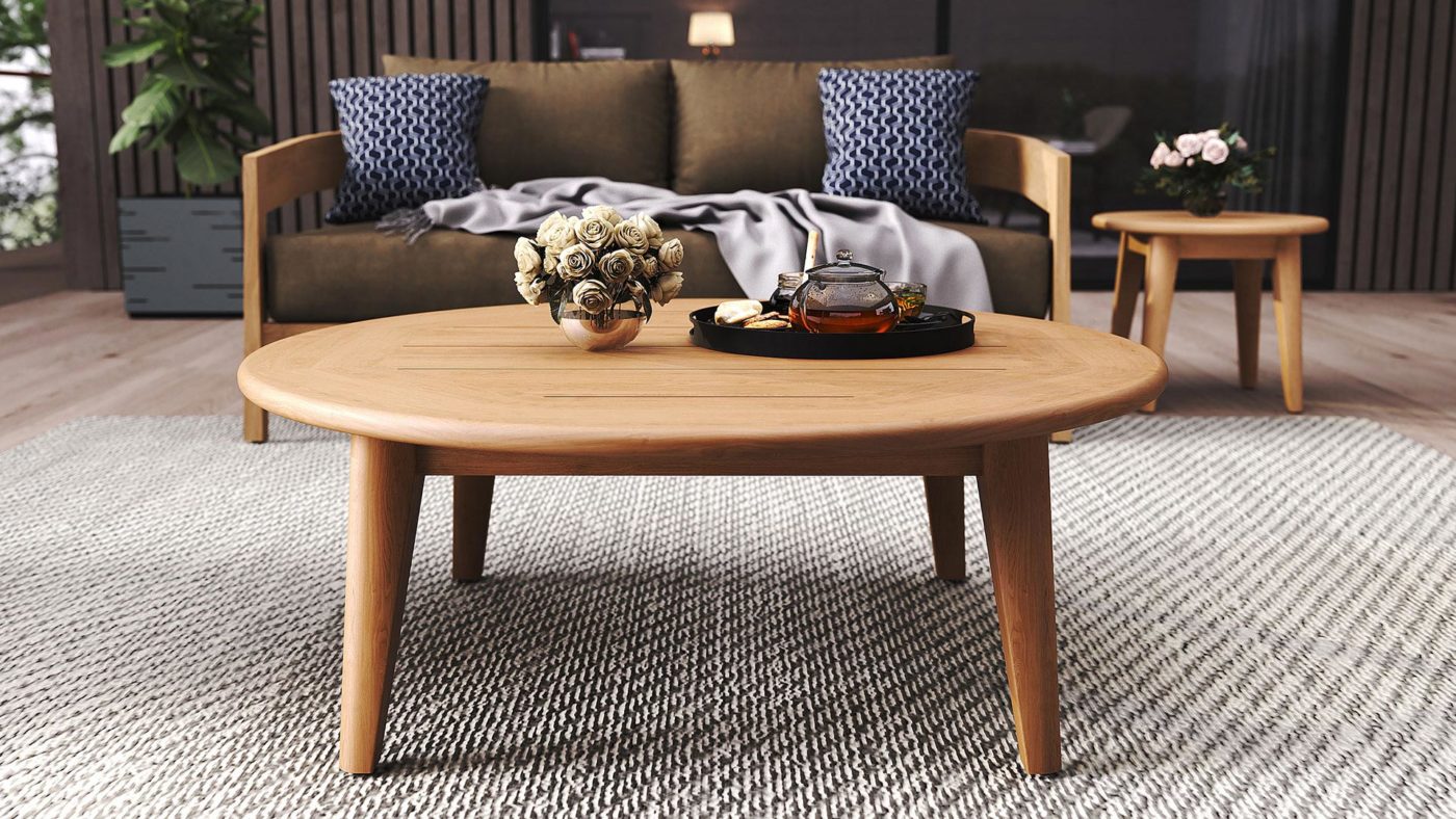
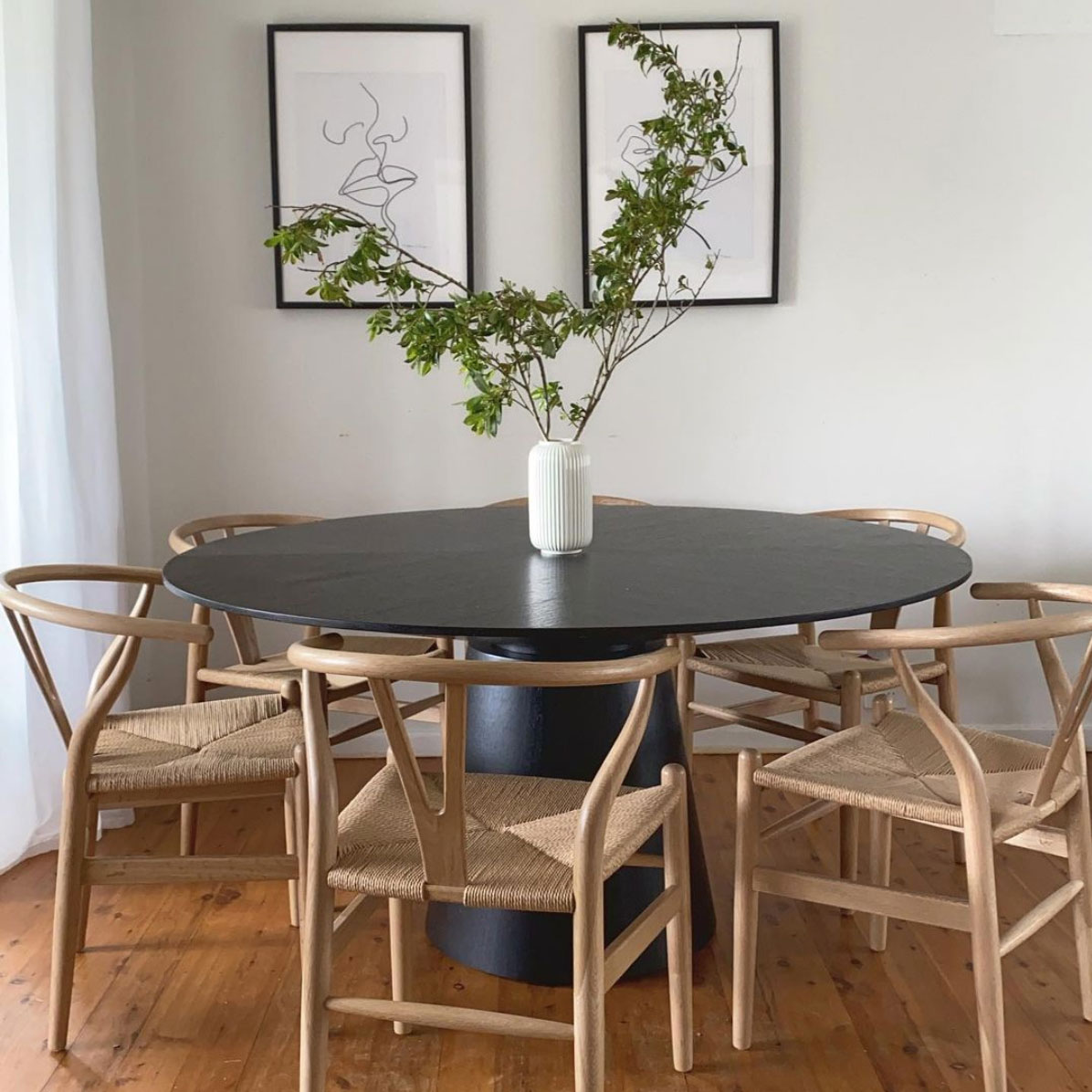
Styling timber panelling and pieces is not necessarily about matching grain and finding perfect colour. Contrasting dark with light timbers adds depth, creating a layered space. Mixing timber tones can highlight the natural finishes in each piece; just be careful not to overwhelm your space. We suggest you maintain a balanced look by limiting to three timber types in each room.
Check out our handy styling tips below –
Match the Undertones
One key tip for mixing wood tones is to match the undertones of different pieces. Almost any timber tone can be matched together providing they have matching undertones. First of all, determine if your dominant wood is neutral, cool (blue, white, or grey undertones), or warm (red, yellow, or orange undertones). Now create a coherent thread by staying with that tone when choosing supplementary pieces. Note that the most versatile are woods with neutral tones because they can mix with both warm and cool tones.
If you have timber floors, this is your dominant wood tone. Alternatively, choose the largest furniture piece in your room, like a dining table, dresser, or desk. Always refer to your dominant shade first when selecting other wood tones to add to your space.
Create Continuity with Shape or Finish
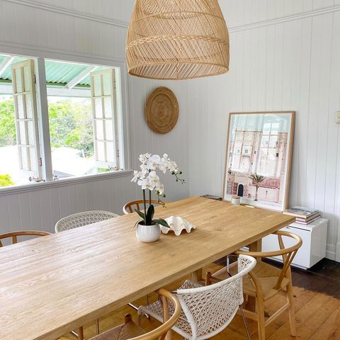
It’s important to create continuity with similar timber grains or finishes. Let’s say your wood floor and/or table is glossy, we suggest you carry on with this finish and choose chairs or side tables in a glossy finish.
If you’re mixing a number of different tones of timber together, continuity can be created by choosing timber furniture pieces and accessories with similar finishes, like grained, matte, or gloss.
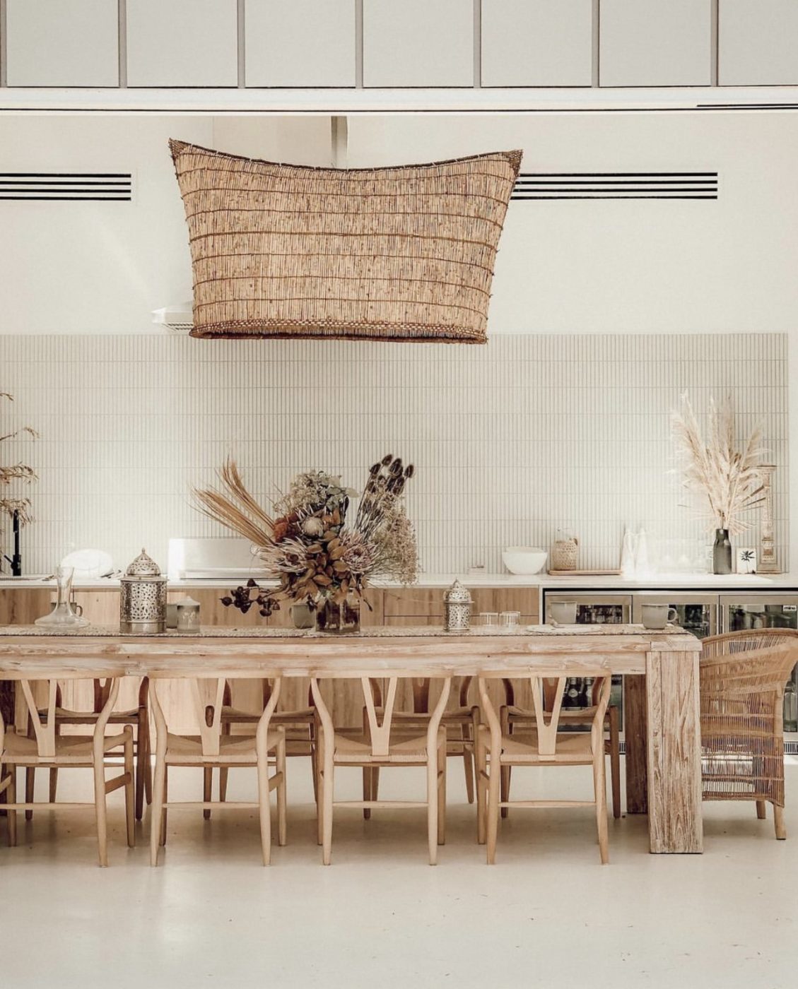
Common elements can be created through finish, shape, or period. While we’re not saying you should commit to repetitive shapes, we are suggesting you stick with either intricate patterns or clean lines. Now you can create a cohesive, seamless look by ensuring they are all raw, or have a glossy finish. You can mix finishes, but don’t make them glaringly obvious.
Balance Pattern and Direction of Grain
Every item of furniture or piece of timber panelling has a direction of grain with a unique pattern. If your flooring flows in one direction you can create the appearance of a wider space by aligning the larger pieces of furniture along these same lines. For items like driftwood sculptures and other decorative pieces, try different ideas to see if you can draw focus and highlight intricate details. For added interest try incorporating chevron patterning, which follows a directional flow at different angles.
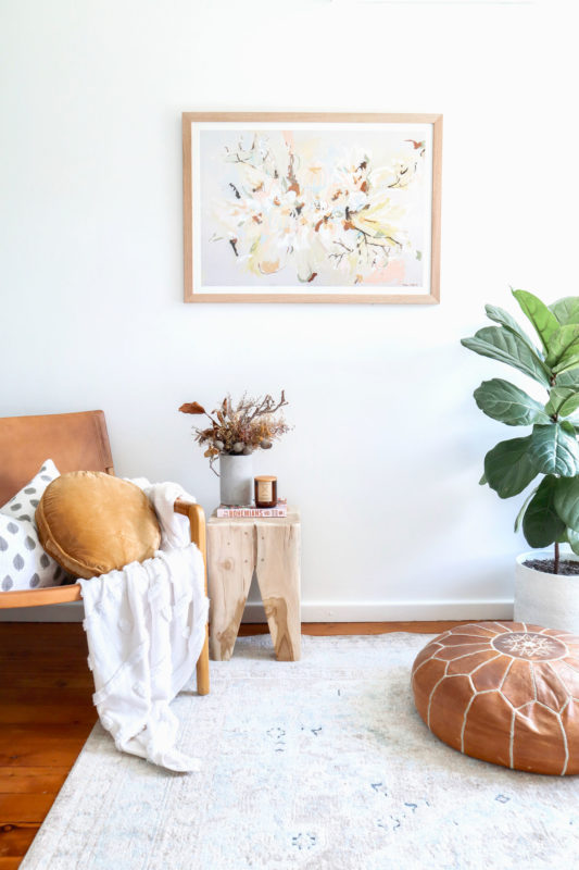
Experiment with Contrast
Contrast can work for you if you have the courage to experiment, but we do suggest you don’t rush into adding high contrast tones. Playing around with contrast can add visual interest and depth to a design while repeating shades. For example, adding deep ashy stains against bleached driftwood can work very well, but stick with two or three colours, and allow one to shine through as the hero. The remaining two colours should add contrast through accenting pieces. You can start being more daring once you become more confident with contrasting. Like black and white paint schemes, high contrast colours are always classic and always in vogue.
Mixing Texture and Forms
Try working with distressed or knotted timber or contrast polished timber surfaces with a live edge. These unusual features allow you highlight the beauty of your chosen timbers, at the same time adding dimension to spaces that are timber heavy.
[ux_products type=”row” ids=”7429,16228,7428,4891,4889,7431,15894,8791,15986,17438,10919,4893,8058,16258,16923,17632,16910,16760,16750,16987,17001,17021″]